날짜별로 특정 데이터에 대한 추이를 볼 수 있는 그래프에 대한 요구사항을 받아 chart.js를 이용하여 데이터에 대한 추이를 볼 수 있는 그래프를 개발하였다.
설계
개발하기 전에 개발 피그마를 이용하여 생각을 정리하였다. 확실히 그림과 같이 생각을 정리하는 것이 좋다고 생각이 들었다.
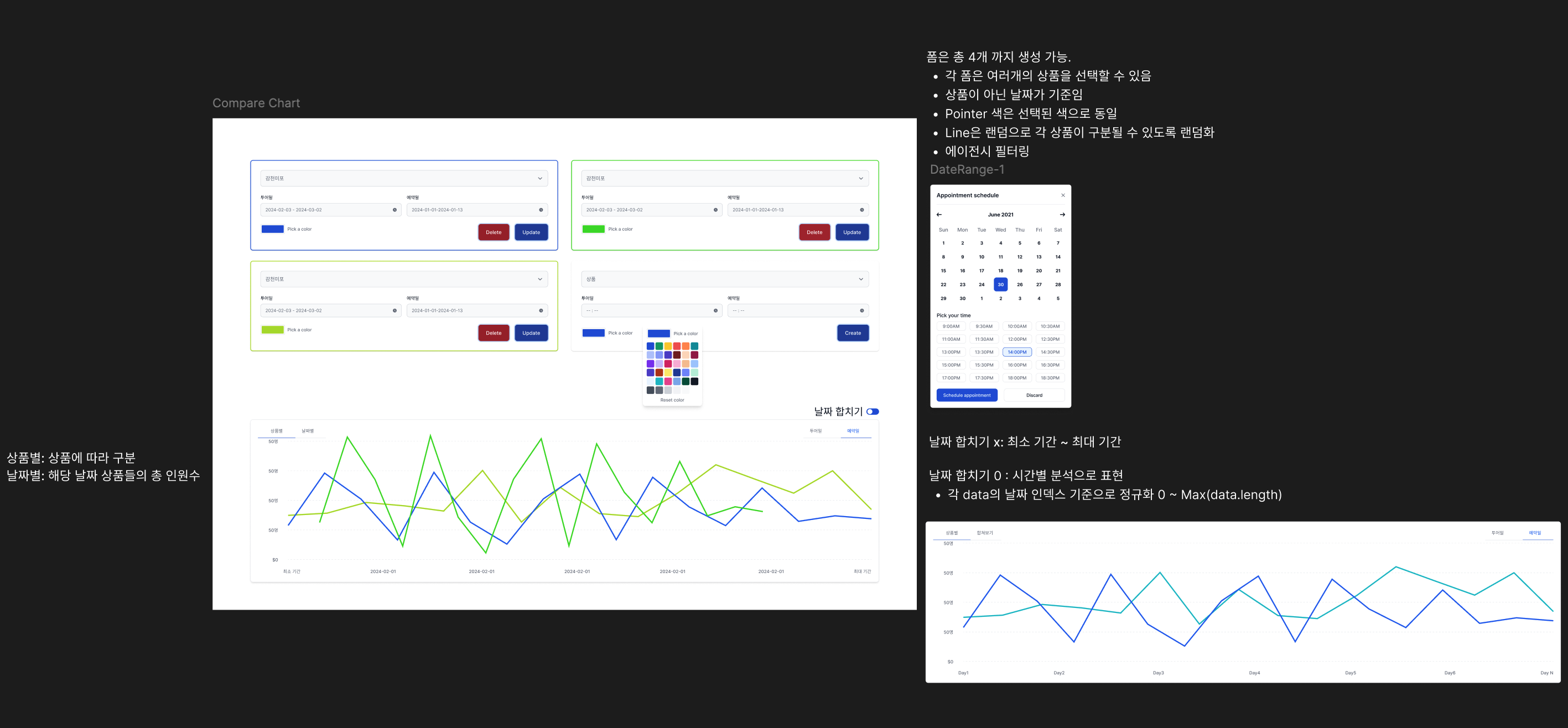
데이터 필터
날짜별로 데이터를 구성하고 필터링이 가능한 폼을 만들었다. 최대 4개까지 가능하고 새로 필터 폼을 생성하면 이전 필터 폼의 상태를 공유도록 하였다.
해당 프로덕트는 서버 상태를 관리할 수 있는 React Query를 사용하지 않아 매번 서버와 통신을 하였는데, 이번에 이전 데이터를 공유해야하는 요구사항이 있어, 이번 계기로 React Query를 적용하였다. 전체적으로 적용하고 나면 속도뿐만 아니라 비용도 많이 줄일 수 있을 것 같다.
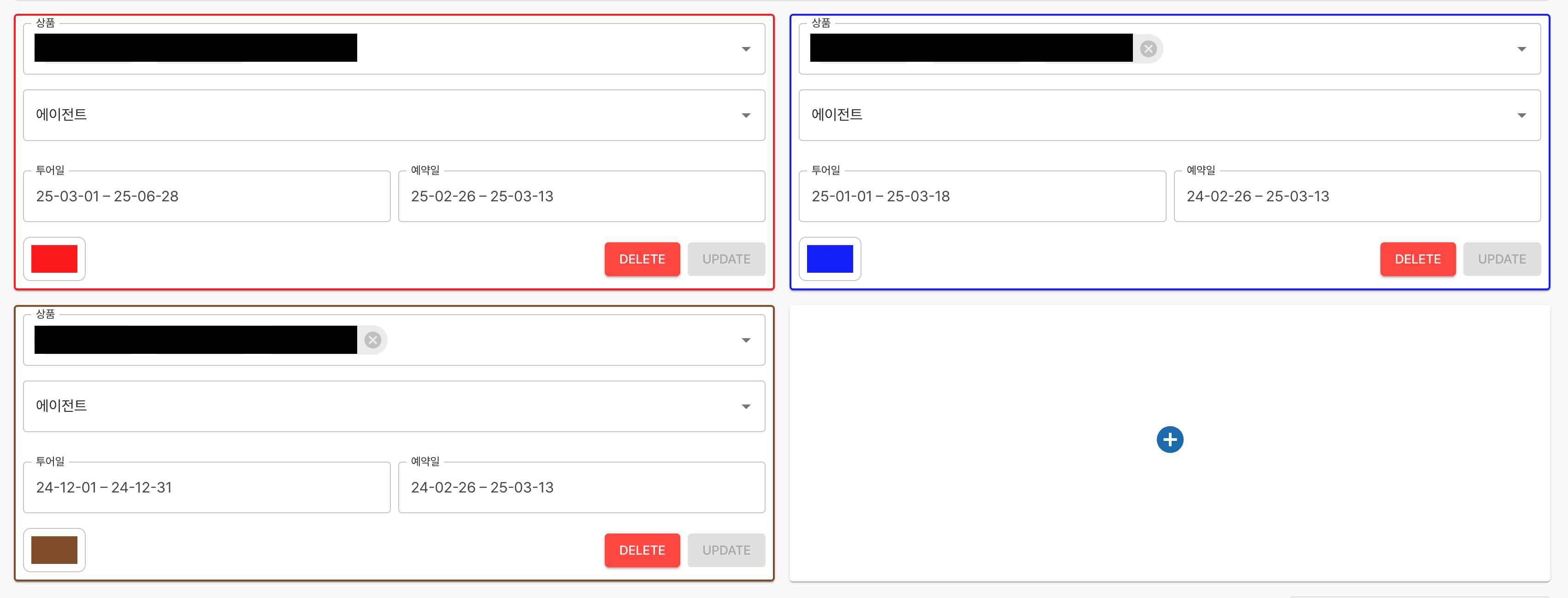
사용자가 보다 쉽게 필터 폼을 인지할 수 있도록, 라인 색에 따라 카드의 border도 동일한 색상으로 변경하도록 하였다. 또한 이전 필터 데이터를 비교하여 동일하다면 업데이트 버튼을 disabled 처리를 하여 필터 데이터가 변경 되었는지 한번에 알 수 있도록 구현하였다.
데이터 설계
날짜별 분석과, 시간별 분석, 비교할 데이터(2개), 필터 폼 별, 각 데이터 별 등 유연하게 차트를 변경해야 됐다. 유저의 행동에 따라 차트 데이터 변경이 일어나야 하는데 유저 상호작용이 있을 때마다 처음 부터 데이터를 구조화하는 작업은 효율적이지 못하다고 생각하였다.
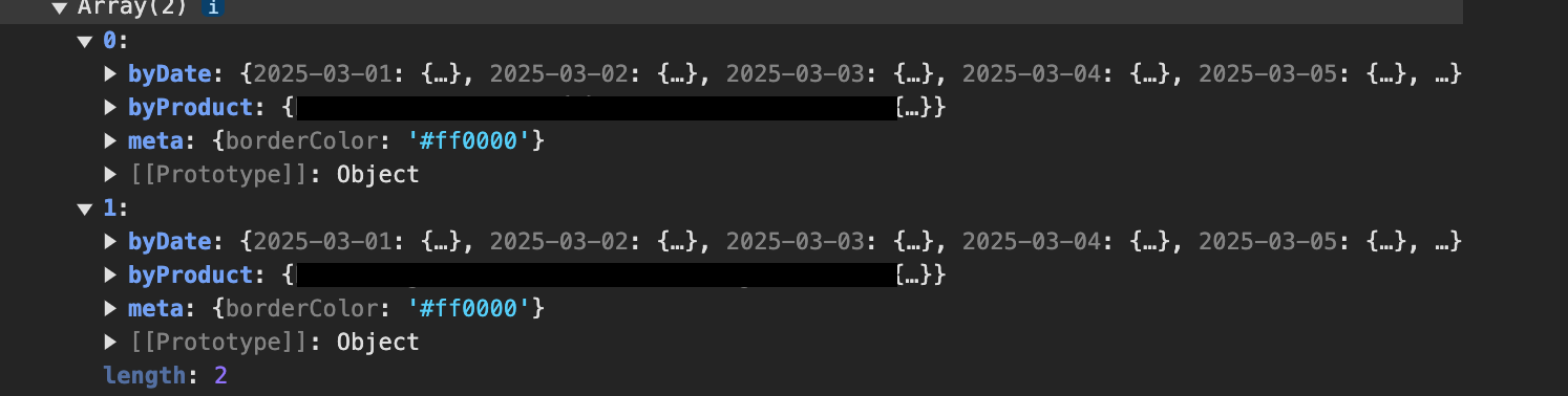
따라서 필요한 부분에 있어서 데이터를 미리 정규화하여 추가적인 데이터 업데이트가 없다면 정규화된 데이터를 가지고 사용자 인터렉션에 맞게 조정하였다. 추후 추가적인 비교할 데이터 종류가 추가될 수도 있어 유연하게 대처하기 위해 정규화 데이터를 만드는 함수의 특정 인자를 callback 함수로 만들어 외부에서 쉽게 추가할 수 있도록 구성하였다.
아무래도 데이터가 많고 조정하는 과정도 시간 복잡도가 크다보니 효율적인 렌더링과 속도를 최적화 하기 위해 최대한 useMemo를 사용하여 불필요한 연산이 없도록 최적화를 하였다.
차트
차트는 chart.js를 사용하였다. 해당 프로덕트는 React로 구현하였기에 react-chart-js를 사용해야 한다. 차트 타입은 line을 사용하였다.
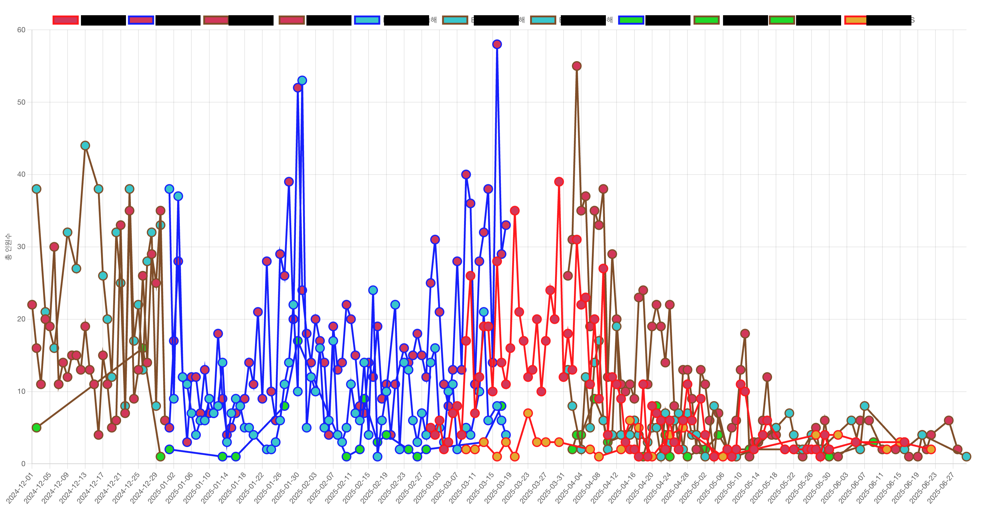
필터 폼의 색은 차트 라인에 지정하였고 서로 다른 데이터 종류를 구분하기 위해 데이터 종류마다 고유의 랜덤한 색을 차트 포인터에 적용하여 데이터를 구분할 수 있도록 구현하였다.
export const generateUniqueColor = (
  excludedColors: string[] = [],
  threshold: number = 80,
): string => {
  const maxAttempts = 50

  for (let attempts = 0; attempts < maxAttempts; attempts++) {
    const newColor = chroma.random()
    const colorHex = newColor.hex()

    const isSimilarToExcluded = excludedColors.some(
      (excluded) => chroma.distance(colorHex, excluded) < threshold,
    )

    if (!isSimilarToExcluded) {
      return colorHex
    }
  }

  return chroma.random().hex()
}
Plugins
Tooltip
각 포인터의 마우스를 hover하면 해당 포인터에 해당하는 데이터를 보여주는 plugin이다. 각 데이터의 차트 포인터와 차트 라인 색을 Tooltip 텍스트에 동일하게 적용하여 구분하기 쉽도록 만들었다.
tooltip: {
 callbacks: {
  title: (tooltipItems: any) => {
   return `날짜: ${tooltipItems[0].label
    .split(",")
    .filter((l: string) => l !== "")
    .join(", ")}`
  },
  labelTextColor: function (context: any) {
   const color = context.dataset.borderColor
   return color
  },
 },
 backgroundColor: "#ccc",
 titleColor: "#222",
 fontSize: 20,
 boxPadding: 8,
 usePointStyle: true,
 pointStyle: "circle",
 boxWidth: 14,
 boxHeight: 14,
},
Legend

Legend는 현재 그래프에 존재하는 데이터를 나타내준다. Legend를 클릭하면 해당 라인이 삭제 또는 표시된다. 각 필터 폼에 동일한 데이터가 존재하여 동일한 데이터라면 같이 이벤트가 발생되도록 변경하였다.
legend: {
 position: "top" as const,
 labels: {
  sort: (a: LegendItem, b: LegendItem) => a.text.localeCompare(b.text),
  fontSize: 16,
  pointStyle: "circle" as const,
 },
 onClick: (_: ChartEvent, legendItem: LegendItem, legend: LegendElement<"line">) => {
  const clickedText = legendItem.text

  legend.chart.data.datasets.forEach((dataset: any, index: number) => {
   if (dataset.label === clickedText) {
    const meta = legend.chart.getDatasetMeta(index)
    meta.hidden = !meta.hidden
   }
  })

  legend.chart.update()
 },
},
Zoom and Pan
줌과 드래그는 chartjs-plugin-zoom를 사용하면 쉽게 적용이 가능하다. modifierKey를 통해서 보조키 설정이 가능하다.
zoom: {
 zoom: {
  wheel: {
   enabled: true,
   modifierKey: "ctrl" as const,
  },
  drag: {
   enabled: true,
   modifierKey: "shift" as const,
  },
  mode: "x" as const,
 },
 pan: {
  enabled: true,
  mode: "x" as const,
 },
},
반응형
Chart를 부모 태그를 기반하여 리사이징이 가능한데 부모 태그에 {position : relative} 스타일과 옵션에 responsive : true를 적용해주면 반응형이 적용된다.
Custom Plugin
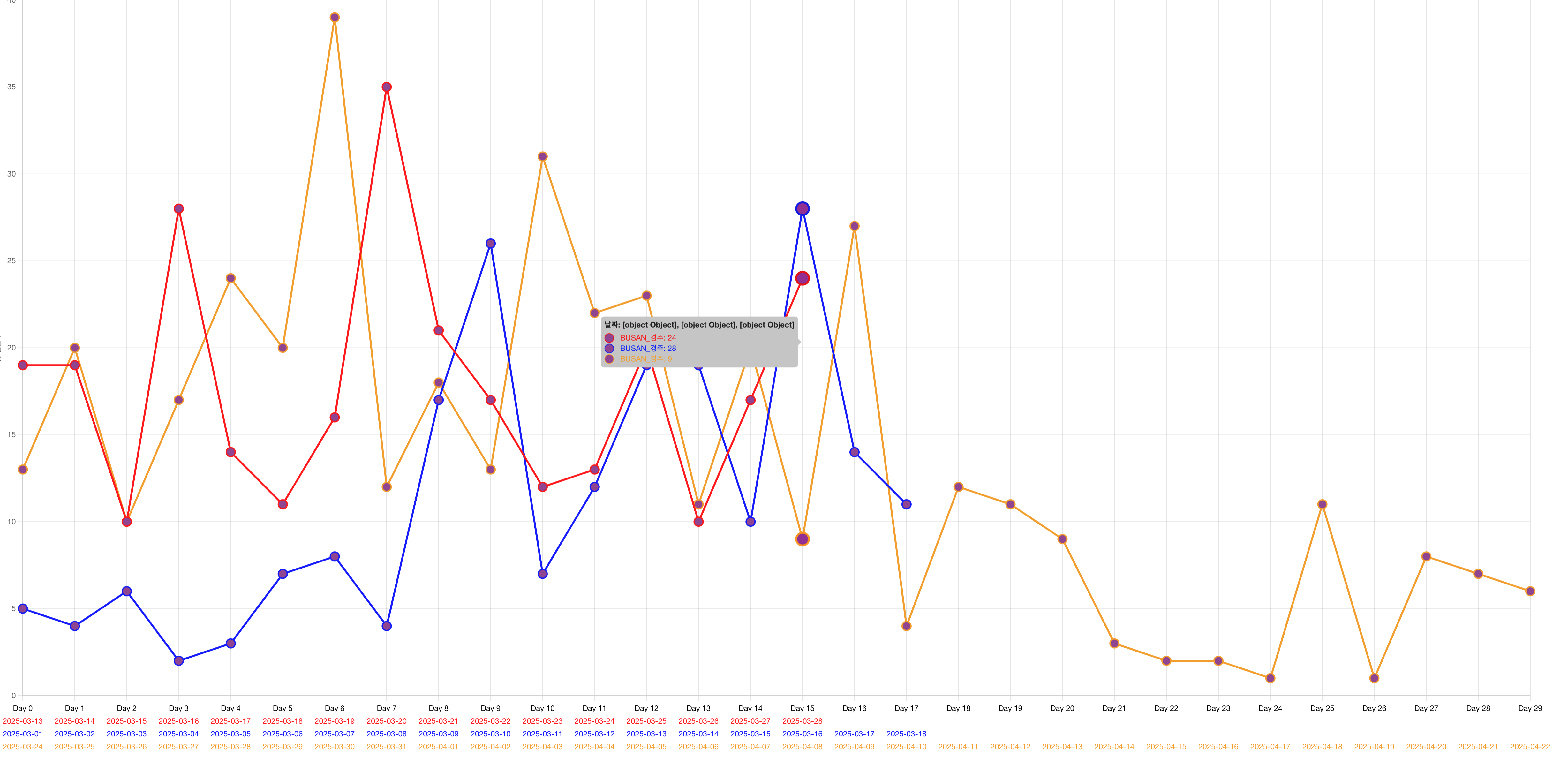
시간별 분석에 있어 X축의 라벨을 각 필터 폼의 날짜를 표기하고 색을 지정하여야 했다. X축의 라벨을 한 틱마다 여러개 사용하는 것은 배열을 반환하는 방법으로 해결이 가능했다.
scales: {
 x: {
  ticks: {
   callback: function (value: any, index: any) {
    const context = this as any
    const label = context.getLabelForValue(value)
    if (Array.isArray(label)) {
     // 배열로 반환
     return [`Day ${index}`, ...label.filter((l) => l !== null)]
    }

    return label
   },
  },
 },
하지만 라인 색에 따라 라벨에 색을 지정하고 싶었지만, 따로 chart.js에서 기능을 제공하지 않아 직접 만들었다.
export const multiColorLabelsPlugin = {
    id: "multiColorLabelsPlugin",
    beforeUpdate(chart: any) {
        const config = chart.config.options.plugins?.multiColorLabelsPlugin
        if (!config?.enable) {
            return
        }

        if (!chart.options.layout) {
            chart.options.layout = { padding: {} }
        }

        const labels = chart.data.labels || []
        let maxLines = 1

        for (const label of labels) {
            if (Array.isArray(label)) {
                maxLines = Math.max(maxLines, label.length + 1) // +1은 "Day N" 라인
            }
        }

        chart.config.options.scales.x.ticks.display = false
        chart.options.layout.padding.bottom = maxLines * 20
        chart.options.layout.padding.bottom += 20
    },
}
x축을 표현하기 전에 beforeUpdate callback 함수를 통해 라벨의 줄의 개수를 계산하여 라벨이 위치할 수 있는 공간을 확보하였다.
afterDraw: (chart: any) => {
 const config = chart.config.options.plugins?.multiColorLabelsPlugin
 if (!config?.enable) {
  return
 }
 const { ctx, scales } = chart
 const xScale = scales.x

 const gap = xScale.ticks.length > 1 ? xScale.getPixelForTick(1) - xScale.getPixelForTick(0) : Infinity

 const labels = Array.isArray(xScale.ticks[0].label) ? xScale.ticks[0].label : [xScale.ticks[0].label]
 const maxLabelWidth = Math.max(...labels.map((l: string) => ctx.measureText(l ?? "").width))
 //INFO: +면 겹치지 않음, - 겹침
 const diff = gap - maxLabelWidth
 const rotationFactor = 2
 const angleDegrees = diff > 0 ? 0 : diff * rotationFactor
 const rotation = (angleDegrees * Math.PI) / 180

 chart.data.labels.forEach((label: any, i: any) => {
  const x = xScale.getPixelForTick(i)
  const isLabelArray = Array.isArray(label)

  let yOffset = 20
  ctx.save()
  ctx.textAlign = "center"
  ctx.translate(x, chart.chartArea.bottom + yOffset)
  ctx.rotate(rotation)
  ctx.fillStyle = "#000"
  ctx.fillText(isLabelArray ? `Day ${i}` : label, 0, 0)
  ctx.restore()

  if (isLabelArray) {
   label.forEach((l: any) => {
    yOffset += 20
    ctx.save()
    ctx.textAlign = "center"
    ctx.translate(x, chart.chartArea.bottom + yOffset)
    ctx.rotate(rotation)
    ctx.fillStyle = l.color || "#000"
    ctx.fillText(l.value ?? "", 0, 0)
    ctx.restore()
   })
  }
 })
},
라벨에 색을 지정하는 것은 어렵지 않았으나 화면 크기에 따라 라벨이 겹치지 않도록 회전을 시켜줘야되는 문제가 있었다. 라벨의 픽셀 길이와 틱의 차이를 구하여 회전 각도를 동적으로 조정하였다.

구현은 잘 되었지만 하나 문제가 있는 부분이 라벨이 동적으로 회전하게 되었을 때(화면이 크기가 변할 때) 하단 공간의 높이도 동적으로 변경해줘야 한다. chart.options.layout.padding.bottom += 20 코드와 같이 적용해보았지만 레이아웃 동적으로 변하지가 않아, 현재는 최대 회전(90도)이 되었을 때 높이를 미리 확보하는 방법으로 문제를 해결하였다.